Creating A Cover For “THE BRIDGE”…
By now, you all know I’ve been working on the book cover for my Paranormal/Mystery/Sci-Fi novel “THE BRIDGE”. It’s been an interesting experience, which I do not recommend it for everyone unless you’re an artist yourself. It has it’s pros and cons. In my case I love having way more control over the creation of the image that is going to basically be my “Introductory Handshake” to the world. Remember, this is going to be my debut novel and I want to catch peoples attention who have no idea what to expect when they first see the cover.
Now, I’ve seen images used on books that I thought were interesting but did not always have all that much to do with what actually happened in the story itself. In fact, I’m sad to say, there were a few where the image was more interesting looking than the story. But what really got me on occasion was where there was some kind of really cool scene on the cover that never appears in the story. I felt cheated in a way. Oh the story might have been a good one, but part of me really felt frustrated by that ‘missing scene’. Now, I know we all want to capture the audiences imagination and interest, but I want to make sure I’m being fair about it.
Now in my case, since the title of my novel is “THE BRIDGE” I could’ve just gone with a bridge from around the right time-frame as the one in that appears in my story. But while picturesque, I wanted to add some clues as to what or who the reader may encounter on that bridge. So I decided to add a figure and one in particular stood out in my mind, the “White Lady”. She is a ghostly figure who haunts the bridge, supposedly searching for the baby she lost from it many years ago. But by the same token I wanted to raise some questions in the viewer’s eyes. Why does her hair seem to flow and move like Medusa’s? Is she even human? Are we seeing some kind of Gorgon? Or is she something much more unique and different?
We all need to get the viewers attention by capturing their interest in some subtle or intriguing manner with our book covers. Mind you, not all covers have to be like the old movie posters of Star Wars where we see the tall and impressive Darth Vader looming in the background while Luke and company (who appear much smaller at the bottom) are racing to meet the HUGE threat overshadowing them. It depends on the story itself. It can be subtle with an intriguing character who somehow catches our interest with their good looks or pose. Or can be even more subtle, a building or structure that evokes emotions or a memory that draws the audience towards it.
I’m learning that a lot goes into the creation of a book cover. Luckily I’ve had years of artistic training to draw upon to help me reason out what kind of image I wanted to use. Who or what the ‘star’ of the image was going to be and what kind of backdrop or stage would be helping frame it.
Well, the cover is nearing what I hope will be the final stages. Here’s where it stands now, I hope you enjoy it and that this entry has given you all some good ideas of what to keep in mind when making or getting someone else to make the cover of your book. Take care.
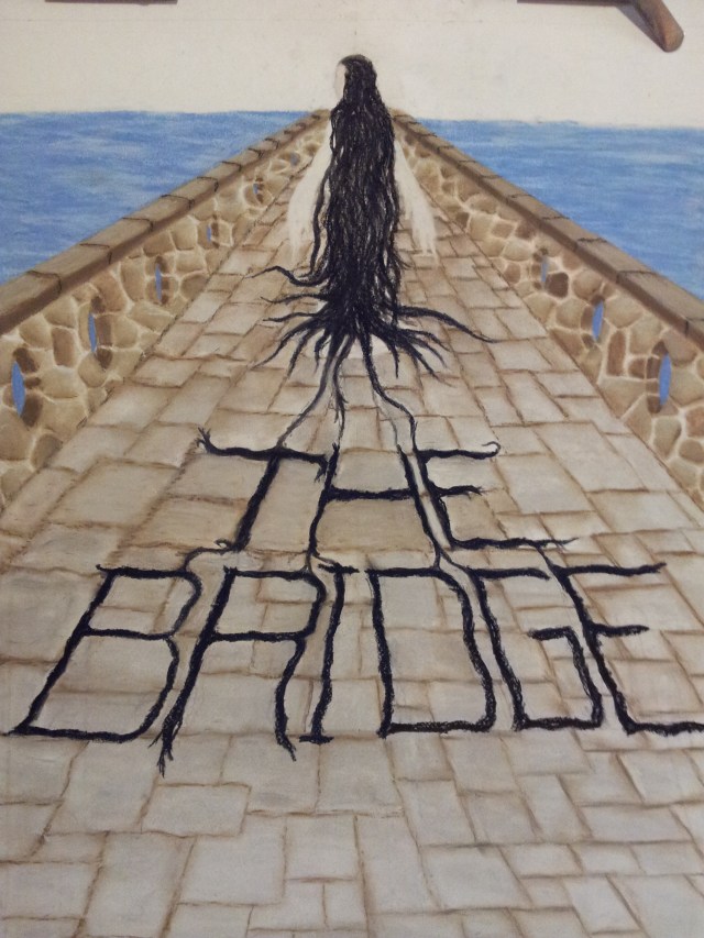


Getting excited to see the final version.